
― CASE STUDY ―

Owl Audio

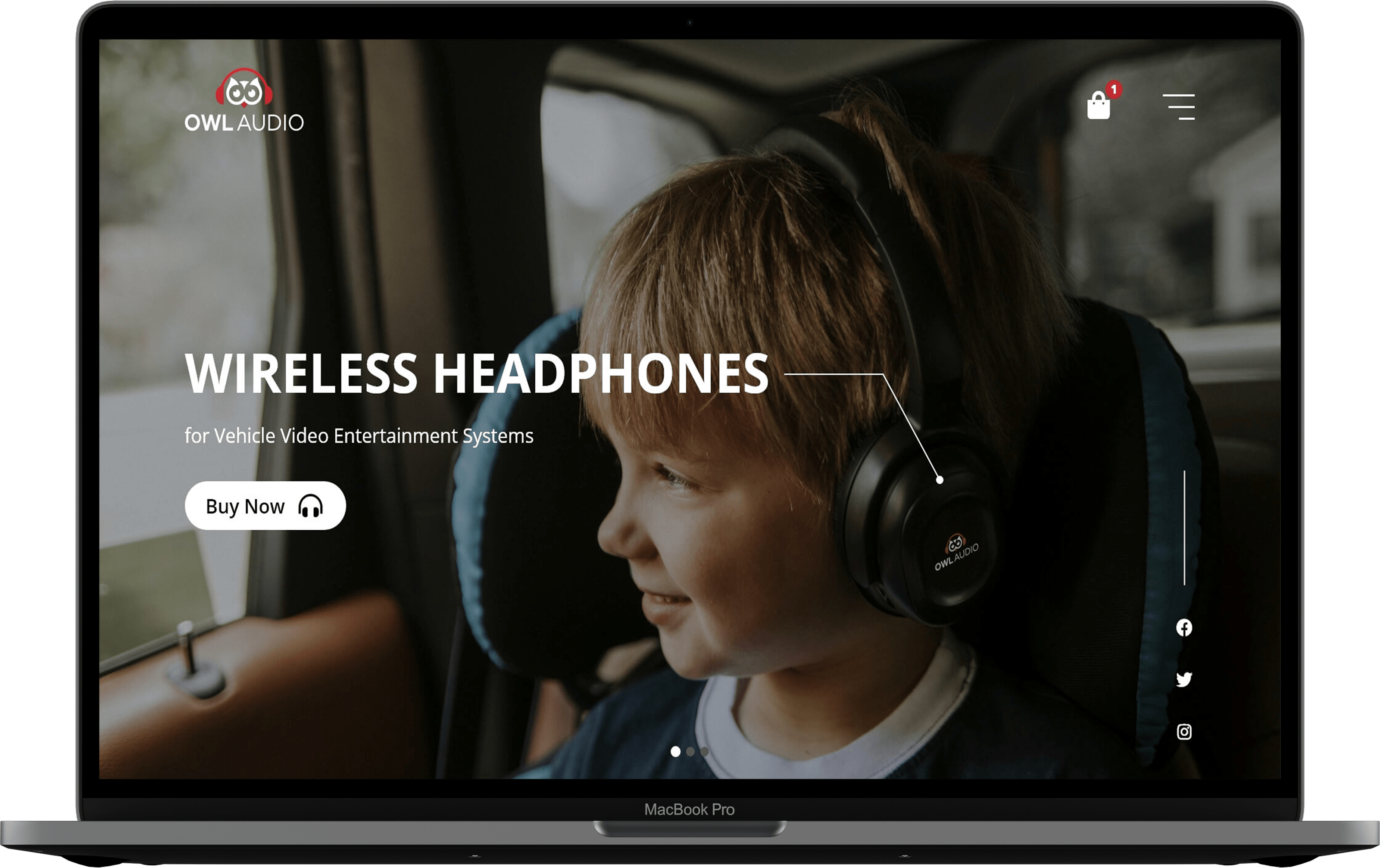
Owl Audio specializes in the design and development of wireless headphones for vehicles. The goal is to design a fresh and minimal website on which the photos tells the story.

OVERVIEW

In this case study, I’ll be explaining my ui design concept for Owl Audio website. The client wants me to redesign their old website and has high expectations for it to be more modern and up-to-date. I’ll take on the challenge and see how it comes together.

TOOLS

Adobe XD Adobe Photoshop

THE CLIENT

Owl Audio specializes in the design and development of wireless headphones for vehicles. All of their products are made with families in mind. Their product team has previously spent many years working in the automotive parts industry. They developed their audio headphones after seeing the need for greater durability, compatibility, fit and comfort.

THE PROBLEM

The client advises us to design an up-to-date and modern website. Their old website is no longer up to date with the new emerging technologies. They wish to launch their new website with a fresh and minimalist design on which the photos tell the story. 

The client also recommends some websites he likes and suggests reiterating it. These are the links given by the client:

  • https://www.phonesoap.com (specifically likes simple navigation bar, product image overlapping flat image (gives it more depth), product page layout that highlights features).
  • https://www.apple.com (clean design, text is minimal, photos tell the story)
  • https://www.daveramsey.com (not too boxy, layers to the design, long form content but easy to browse and digest)

THE WIREFRAME

A good design starts with wireframing, one of the most crucial steps. This is what determines how the website should be laid out. Below is an example of a low fidelity wireframe I designed to visualize how the various components should look and how they ought to be incorporated into place.

THE DESIGN

Based on the client’s preferences, I design a clean, minimalist website in which the images and text tell the story. Selecting the appropriate choice of image and text for the website is a key part of its success.

THE CONCLUSION

Finally, let’s sum up everything. The client’s expectations were exceeded, and I was able to present him with a beautiful and awesome design on which the photo tells the story. I am glad to work with this client, because they are very satisfied with the result.

DISCLAIMER

The client is not a real entity or company. These are just ideas and none of the materials are mine (logos, images, etc.). I just work exclusively on the user interface design. I got all the materials when I took a trial exam to apply for a job.