MacMall recently move and migrate to TigerDirect.com. Both of the website is a little bit old, so I tried to redesign the MacMall thinking if I can make it feel more premium and a separate entity instead a part of TigerDirect. My goal is to tell the users that the Shop is legit and premium as what the Apple products suppose to feel like.
OVERVIEW
In this case study, I’ll be explaining my ui redesign concept for MacMall website. They recently relocated to TigerDirect.com. The website has been around a while, but it’s a little bit old and clunky. Therefore, I came up with my own version of the website and let’s see how it looks now.
TOOLS
Adobe XD Adobe Photoshop
THE CLIENT
MacMall is an authorized online reseller of Apple products. They buy Apple products in bulk, which allows them to sell them at a volume discount. MacMall is a wholly owned subsidiary of PCM, Inc.
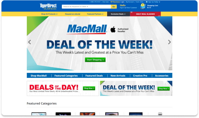
THE PROBLEM
There is no website for MacMall anymore, and they have become part of TigerDirect, however their website design is a bit old-fashioned and not quite modern. On the website, there’s just too much color and no branding for it to be recognized as an apple brand anymore.
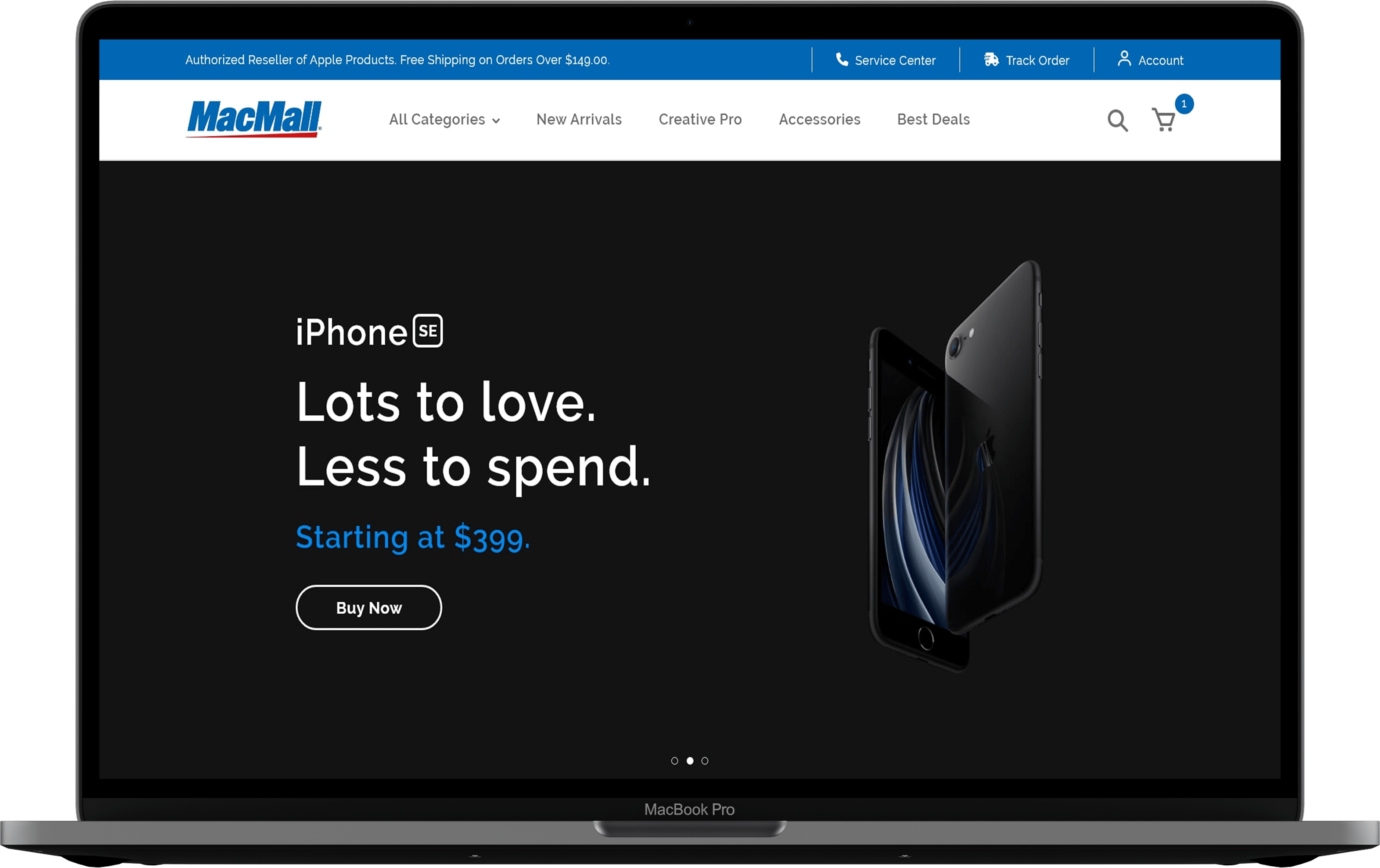
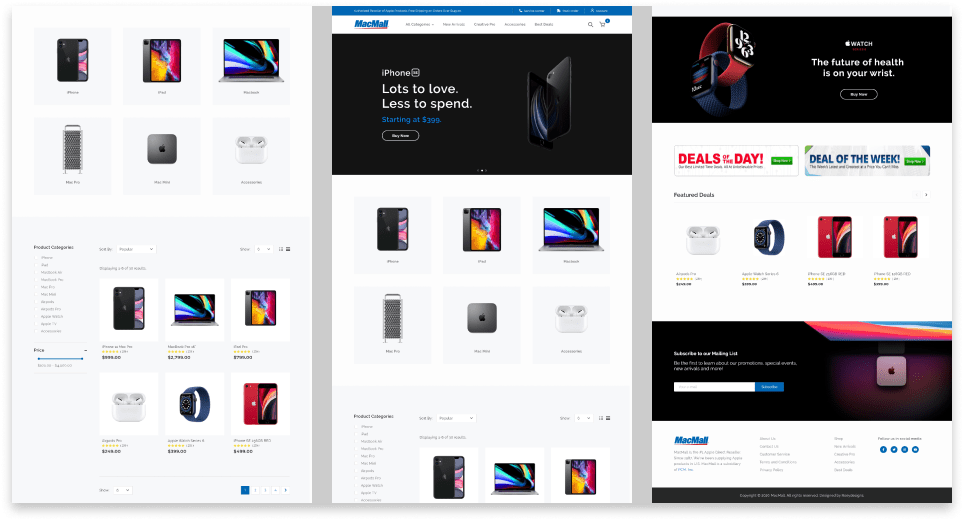
THE DESIGN
I designed it to be premium and clean. My goal is to tell the users that the Shop is legit and premium as what the Apple products suppose to feel like while still applying the MacMall color pallette. The website must be well-organized and professional. My aim is to tell consumers that shopping at it is like shopping in the real Apple Store.
THE CONCLUSION
Finally, let’s sum up everything. I’ve learned so much in redesigning the MacMall; it teaches me more about branding and how to make a clean yet beautiful web design.
DISCLAIMER
The client is not a real entity or company. These are just ideas and none of the materials are mine (logos, images, etc.). I just work exclusively on the user interface design. All the materials I’ve used belongs to TigerDirect, MacMall, and Apple.